The Marks of Randolph's
Four symbols. None of them decoration. Each one means something specific, and each one is carried into every piece that leaves this bench.
Why We Have Marks, Not Just a Logo
Most businesses have a logo. We have four marks, and there’s a reason for the difference. A logo identifies a company. A mark carries a meaning. We built four of them because there wasn’t one symbol that could hold everything this business is — who we are, where we’re headed, how we work, and why we do it. So instead of compressing all of that into a single image, we built a small system. Each mark has its own job. Together, they say the whole thing. You’ll see these throughout this site, on the documents we send you, and eventually on the pieces themselves. This page is here so none of it is a mystery.
The Logo

The Story Behind Our Logo
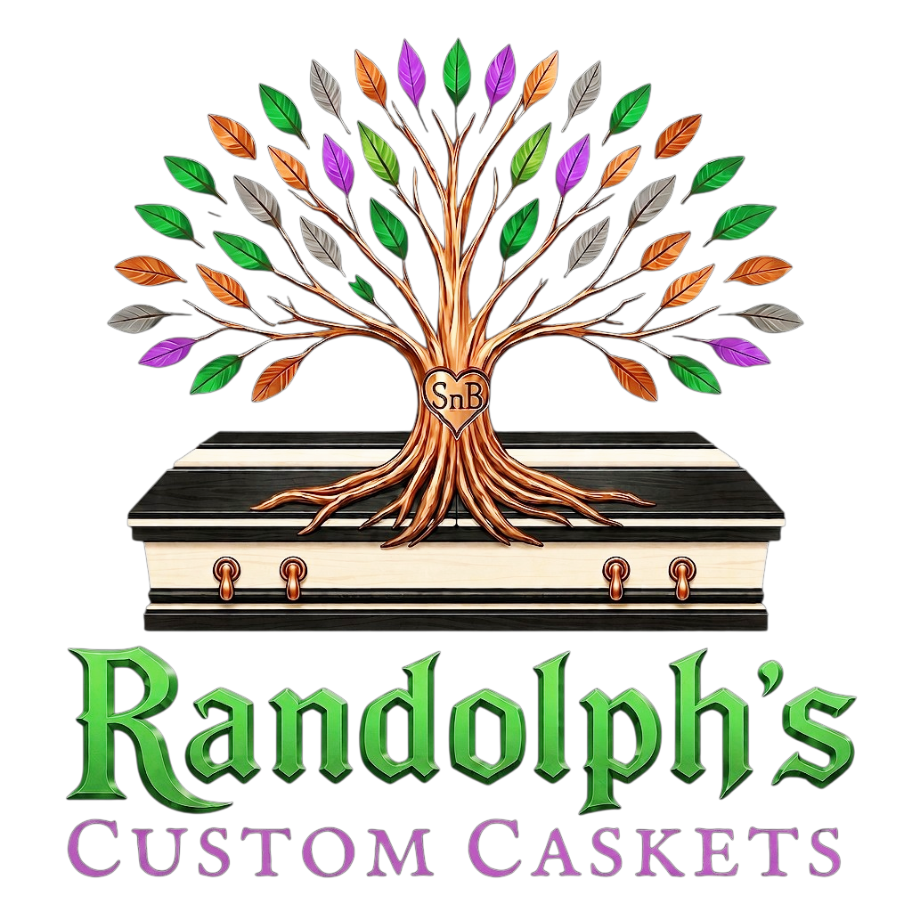
A tree grows from a casket, and the casket is built the exact way we actually build them on the bench. That is the whole idea. We work with wood—a tree standing in a forest becomes lumber, and that lumber becomes the last physical resting place a family carries someone home in. The logo shows that entire process in a single image rather than trying to explain it: living growth above, finished craft below, and one continuous form connecting the two. Nothing about that relationship needed inventing. It’s just the reality of what we do, drawn plainly.
The casket at the base isn’t a generic silhouette. It’s constructed in our signature paired-grain style—two wood species and two distinct tones worked together, the same way our very first commission was built and the way we’ve built dozens since. If you commissioned a piece from us tomorrow, this is closer to what would actually leave the bench than any stock casket outline ever could be.
Even the colors hold purpose. The canopy runs through deep lilac, copper, warm white, and charcoal—the same natural range of tones you find across the hardwoods we actually work with, from oak and walnut to cherry and pine, where no two boards are ever quite the same.
Right at the center of the trunk, carved directly into the wood, is a heart with SnB. To the rest of the world, it’s just a maker’s mark, but to us, it stands for Steph n B. It’s a plain, honest reminder that while this casket-building tradition spans five generations of family history, the daily execution, the heavy lifting, and the profound responsibility of this craft are carried forward by the two of us, side-by-side. Everything we build passes through both of our hands before it ever leaves our doors.
Below the tree, the name follows in two parts, split by intention. “Randolph’s” is set in a bold, commanding forest green—the exact same color as the living canopy above, carrying the weight of a family legacy that is still actively growing. “Custom Caskets” follows in a quieter, understated purple. We set it apart deliberately, because the precision, the skill, and the ultimate significance of the craft itself deserve a different weight than the family name behind it.
The RCC Color Palette
Seven colors run through everything we build, print, and publish. None of them were picked to look good on a screen first. Each one was picked because it already meant something before it became part of this brand.
Forest Green — #17A347
The primary color. The color of the canopy in the logo, the color of these mountains most months of the year, and the color of anything on this site meant to move — headlines, calls to action, the parts of a page asking you to take a next step. Green carries the growth idea the tree already established. Everywhere else on the site, it’s doing the same job the tree does in the logo: signaling something still alive, still moving forward.
Copper — #B87333
Real material, not a color chosen to evoke one. Copper hardware, copper accents, copper finishes appear on actual pieces we build — this color exists on the site because it exists on the bench first. We use it selectively: dividers, premium moments, the diamond mark itself. Copper doesn’t appear everywhere, because in the real world, copper doesn’t either. It shows up where something is worth marking as a little more considered than what surrounds it.
Purple — #9966CC
The one color on this site used the most sparingly, and that’s intentional. Purple carries “Custom Caskets” in the logo, the Library card, and a handful of hover states — never a headline, never a large surface. Historically, purple dye was among the hardest colors to produce, which is exactly why it was reserved for the smallest, most deliberate uses rather than everyday ones. We use it the same way: rarely, and only where something deserves to be set apart from everything around it.
Charcoal — #2A2A2A
The default. Most of this site lives here — the color of the workshop after the lights are lowered, the color of worked iron, the color the casket itself is partly built from in the logo. Charcoal isn’t black. Black would feel clinical. Charcoal has warmth in it once you sit with it, the way a well-used tool has warmth in it that a new one doesn’t yet.
Old Lace — #FDF5E6
Where the site needs to be light, it’s never stark white. Old Lace is warmer — closer to aged paper, raw linen, the color of a page that’s actually been read rather than one fresh off a printer. It’s the second color the casket in the logo is built from, alongside charcoal. The two together are the same pairing running through this entire brand: dark and warm-light, never dark and cold-light.
Gray — #A4A4A4
A quiet neutral, used where something needs to recede rather than speak — secondary labels, fine print, the kind of detail that should be findable without demanding attention.
Silver — #C0C0C0
The color of a freshly sharpened blade. Silver carries body text on our darker backgrounds and outlines our ghost buttons — present, legible, doing real work, without ever competing with the green, copper, or purple around it. Every good tool has a silver edge somewhere on it. This is ours.
Typography for RCC
Five typefaces, each with exactly one job. None of them overlap in purpose, and none of them appear where they don’t belong.
UnifrakturMaguntia
Reserved entirely for the word “Randolph’s” in the logo. It appears nowhere else on the site, in no other context. A Gothic blackletter hand this heavy only works as a single, deliberate mark — used anywhere else, it would stop reading as identity and start reading as decoration.
IM Fell English SC
The workhorse of the site. Small caps, wide letter spacing, used for labels, navigation, button text, and eyebrow lines throughout every page. It’s what “Custom Caskets” is set in beneath the wordmark, and it’s the same typeface doing quiet, structural work everywhere else — the connective tissue between the bigger, louder elements.
Cinzel
Every major headline on the site is set in Cinzel. It carries weight without needing to shout — a carved, architectural feel that reads as permanent rather than trendy, which matters for a business built on the idea that what we make is meant to last.
EB Garamond
Every paragraph of body text on this site — including the one you’re reading right now — is set in EB Garamond. Classic book typography, chosen because it’s built to be read comfortably at length, not just glanced at. We write a lot on this site. The typeface needed to hold up to that.
Courier Prime
Reserved for numbers — pricing, dates, time slots, anywhere a figure needs to read as exact rather than decorative. A monospaced typeface for the one kind of content on this site where precision matters more than elegance.
Mark One - The ℜ

Identity Mark
The R stands for the name. Not just Randolph’s — the family, the lineage, the hands that have done this work for five generations. Where you see the R alone, unaccompanied by any other mark, that’s our signature. It’s what we put on something to say: we stand behind this completely, without qualification. You’ll find it as the site’s favicon, watermarked quietly into the hero section, signing the footer of every page, and — once the shop is fully operational — routed into the crates that carry our pre-planned pieces home.
Mark Two - The Star

Navigational Mark
The star finds its way back to Star Branch — the place that gave this brand its meeting point long before there was a brand to speak of. Before there was a business plan, a workshop, or a single casket built under this name, there was Star Branch — the place where this all actually started, for us, long before it started for anyone else. Every direction this business has taken since traces back to that one point on the map. It’s built in the tradition of the Appalachian barn star: plain, honest, unornamented. Not a compass, not an instrument — a fixed point you orient by, the way people in these mountains have always oriented by the North Star. We don’t tell that story often, and we won’t spell out every detail of it here. But the star carries it anyway, every time you see it. Where the star appears, it points toward something — toward a decision being made, toward a direction being set, toward the next step in a process. It shows up wherever the site or a document is helping you find your way through a choice.
Mark Three - The Diamond


Utility Mark
The diamond carries a spirit level at its center — the tool a craftsman reaches for before anything else, because nothing gets built right if it isn’t level first. This is our workhorse mark. It shows up more often than any other, in smaller and quieter places: a bullet point, a divider between sections, a small accent where something needed marking without needing a statement. It comes in two weights. The plain version is for everyday use — bullet points, dividers, anywhere it needs to do its job without drawing attention to itself. The version with our initials set into the level is reserved for more formal contexts — a contract, a certificate, a plaque. Same mark. Same meaning. Different volume.
Mark Four - The Rune

Mission Mark
The rune is the only one of the four marks that says something outright, in as many words: we craft protected passage for families, with inherited skill. It’s the most important mark in the system and the one we use most sparingly — reserved for the moments where the full weight of what this business is actually about deserves to be said plainly. You’ll find the complete meaning of this mark, broken down phrase by phrase, on our homepage. It isn’t decoration there either. It’s the mission statement, carved instead of typed.
Every mark on this page means something before it means anything on a page. That’s on purpose.